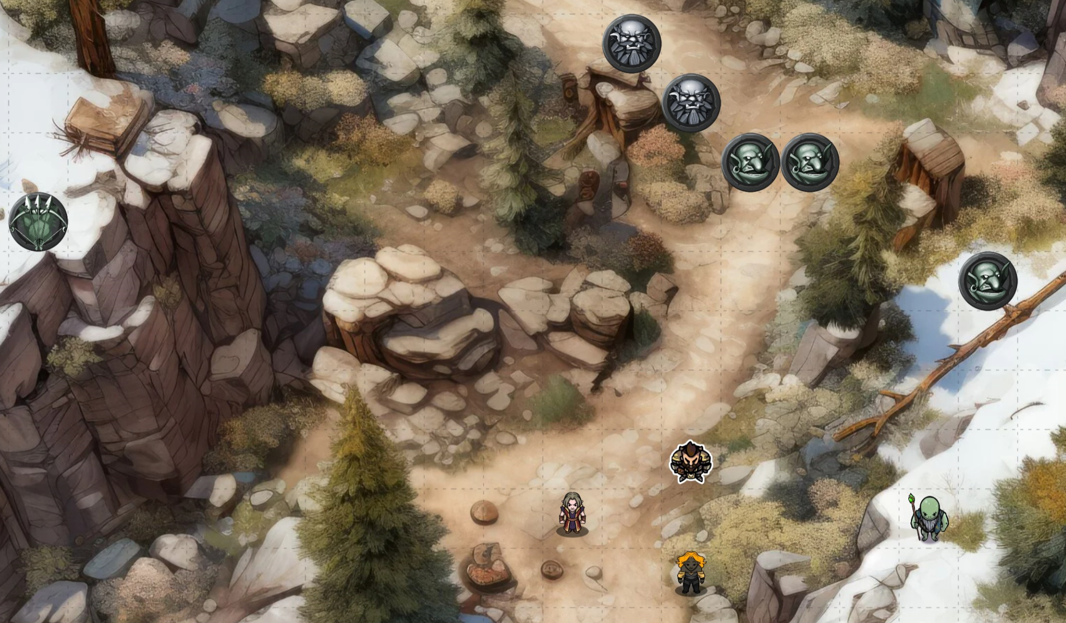
The early morning snow has already melted off the trees here. It is eerily quiet and you worry the Orcs you are supposed to be tracking are tracking you instead.
Your maps are beautiful, but I wonder how well they’d work in actual gameplay. They have an off-centre angle POV which means it would be hard to overlay a grid onto them I think. Do you have a recommended grid size that you use when designing these?
This has been my feeling every time I see one of OP’s maps. They’re gorgeous, I could see Final Fantasy Tactics playing out well on it, but it doesn’t look like it would transfer well to a tabletop RPG.
They work best for VTT and random encounters throughout the world, as opposed to boss fights where you want to be more careful with mechanics. For this one, 24x24 works pretty nicely. It varies from map to map. I do want to get better at provided pre-gridded versions at the correct grid scale and am working on printable PDFs as well. Though as noted, VTT works best when it isn’t perfectly top-down and grid-aligned.
To me map style is a spectrum. On one side is essentially no graphics–grid paper maps, and fully focused on the mechanics. On the other is almost full 3d and even animated, and sometimes the mechanics side suffers a bit for style points.

P.S. these are made with Midjourney (AI). I want to make the best maps I can with it, and want to work towards better layout/perspective control. It’s pretty limited and I discard a lot of maps that aren’t close enough or whose layout is poor, but I’m still learning.


