

- cross-posted to:
- games@sh.itjust.works
- cross-posted to:
- games@sh.itjust.works
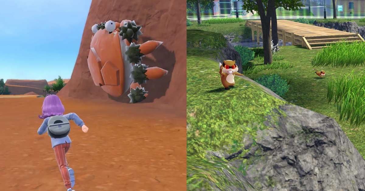
It’s been a while since I looked at a main series Pokémon game and thought, “That looks nice.” This includes last week’s full reveal of Pokémon Legends Z-A, which going from the first bit of footage seems to feature a lot of hazy-edged grey rooftops, futurist UI, and eerily smooth NPCs, and not a lot of consistent, nice-to-look-at art direction to tie it together. This is also a shame. First, because - and I don’t think it’s too controversial to say this - it’s good, generally speaking, when things look nice. Glad we’ve got that established.
Second, and still pretty obvious but at least a bit more interesting: while they’ve never been graphical powerhouses, there have absolutely been times when Pokémon games have looked quite wonderful. And there is undoubtedly room for Pokémon games to look even more wonderful. But the series’ recent, and quite aggressive moves away from that is both a bummer, and, considering Pokémon’s history with artistry - across its spinoff video games, its animations, its strikingly impactful trading card art - a waste.
Saying this out loud among Pokémon fans, however, often leads to some interesting reactions. While even casual observers and non-Pokénerds probably got whiff of controversies like “Dexit”, the nickname for the first time it was revealed less than the entirety of the Pokédex would be catchable in a single game, back at the launch of Pokémon Sword and Shield, fewer will be familiar with “tree-gate” of the same era.
I agree, the last genuinely pretty game was Emerald, imo. Diamond and beyond is where 3D assets started weakening the art direction, imo. Either keep the beautiful pixel art, or do proper cel shaded graphics, like windwaker. Personally, I’d stick with pixel art for the strongest possible art direction.
Random, but you should check out Emerald Seaglass! Beautiful art style combination!
Oooh, that does look pretty!