I enjoy Dungeon Crawl Stone Soup played in the terminal with ASCII graphics. I wonder whether there are other hidden gems out there which don’t get attention because they are “ugly”?
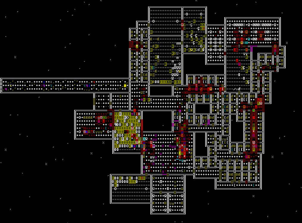
Dwarf fortress and RimWorld are both… Pretty ugly
Yeah especially Dwarf Fortress. The gameplay:graphics ratio is over 9000
That’s improved now, though, with the steam release. Before the Steam release I exclusively played DF with Ascii graphics. Honestly, I thought it was pretty.
I LIKE ASCII graphics done well. It tried playing the version of Stone Soup that uses tiles and couldn’t do it.
It does have a certain charm. I never really played that much tbh, my favorite part was reading the sagas of fortresses on the forums. Those were always so unpredictable and hilarious.
Dcss is the greatest game of all time. Everything about it is good.
But Dwarf Fortress is also good with bad graphics.
Factorio is like crack and looks terrible.
I think the Steam release of DF looks nice. They’re simple graphics, but not ugly.
deleted by creator
I’ll have to give it a go. I bought it to support them. I put in many many hours of DF like 10 years ago. I was sending the guys money too… I wish I could find the drawings they sent me.
I’ve just been playing a lot of DCSS lately because it is so easy to just spin up my browser and be killing kobolds and fire giants.
Agreed. I have more hours in DCSS than any other game.
I don’t think it’s totally fair to call it ugly either. It’s a masterpiece of efficiency. The ASCII looks messy to some people, but after a while you just see right through it; purple Y = catlobe gtfo etc. Plus the upside is that it’s extremely clear at a glance what is going on because you don’t have complicated sprites everywhere. And the handmade vaults that get rolled into the procgen are often really nice looking and give the world a lot of character.
I’ve also been playing since Linley’s! Got my first win way back when Sif channeling was a discrete action and it cost food. I was a mummy so fuck food and I cast summon dragon (also discrete) to fill up the whole screen. Good times.
I have had some people refuse to even try Baba Is You, because it looks ugly.
I had The Hex a few years even installed, so I have tried it, but only after getting familiar with the style of Daniel Mullins’ games with Inscryption I pushed far enough to get interested. Still very clunky, but worth it.
Baba is… Fuck you, you’re stupid, this game is stupid. Fuck you.
I’m stupid 😔
I have had some people refuse to even try Baba Is You, because it looks ugly.
Oh come on, the art style is charming!
Who is saying that Baba is You is ugly? I don’t think I’ve ever heard that opinion. It’s always just been “charming Flash game aesthetic” for me
I love both the style and soundtrack of that game. Maybe it’s a little too “lowfi” for some people. That’s the only way I can imagine someone not liking it.
I felt like a the Hex was one of the most innovative games, I loved it soooo much.
Would Cruelty Squad be cheating?
Wow that art style is… something
It’s like… 2001 shareware shitpost flavored.
There’s another one with a similar kinda vibe (the vibe being “shitpost but it’s a video game”) called Slayers X: Terminal Aftermath: Vengence of the Slayer. I haven’t played it but it looks great. Er… Gameplay wise anyway lol.
Looks like its going for a vibe similar to the original Doom! That trailer on the steam page was amazing.
Yeah. A lot of the UI seems to be intentionally bad. It’s actually a pretty hard game. A good example is reloading. You do this by holding right click, moving the mouse down then up and letting go of right click. I think the visual parts of the experience speak for themselves from the screenshots but my point is that even a lot of other stuff in the game is just wack.
Seconding this; Cruelty Squad is hitting that Deus Ex/Quake itch for me right now
does Doom count? Because my friends and I still play the game to this day, all the various community mods and maps.
FTL, it’s not very ugly, but it could be improved
gorillas.bas Classic😎
qbasic gang we out here
I would say Kenshi with assests that show it was done by one person and a rough UI, also maybe pathologic 2, although for that game I wouldn’t say it’s the graphics that put people off it’s mostly the gameplay, but the geaphics are weird and really grey/depressive
Battle for Wesnoth. Best.Game.Ever (slight exaggeration)
deleted by creator
Tales of Maj’eyal. A free to play open source roguelike that I hate. This game is amazing. Fuck this game. Also definitely recommend. But fuck this game. After numerous 10-12 hour long runs, I have yet to win.
Love me some ToM!
Simutrans is great, but looks like dogshit.
pak192comic and pak128britain actually look half decent, imo, but on the whole you’re right.
Kenshi came to mind as that’s a butt ugly game but probably not as “hidden”. Graphics look on par with Empire Earth 1 zoomed in but it’s really unique and original and the low poly look helps it run on my aging PC so no complaints.
Do you know if there is a good lemmy community for discussing Kenshi? I was about to go on a huge tangent about my experience with the game and stopped myself because this comment section probably isn’t the right place. ^^;;
I don’t know I’m new and still finding stuff. Also I’ve only scratched the surface of Kenshi ATM but if you do find one post it and I’ll join too.
West of Loathing and its sequel Shadows of Loathing have a bland grayscale artstyle on the outside but they’re absolutely hilarious RPGs that have a lot of heart to them.
The loathing series is an absolute gem
Man I played their browser game way back when, the humor was pretty funny, but I haven’t been able to make time to consider trying their console games.
You should give it a shot, it’s pretty fun and West of Loathing isn’t that long to finish.
I haven’t played it, but Cruelty Squad beats 95% of these in uglyness. Probably because they (hopefully) do it on purpose.
That game is beautifully ugly lol. I need to go back and beat all the secret worlds
