
- cross-posted to:
- android@lemmy.world
android-developers.googleblog.com
- cross-posted to:
- android@lemmy.world
You must log in or # to comment.
This should have happened like 12 years ago.
To fit more ads!
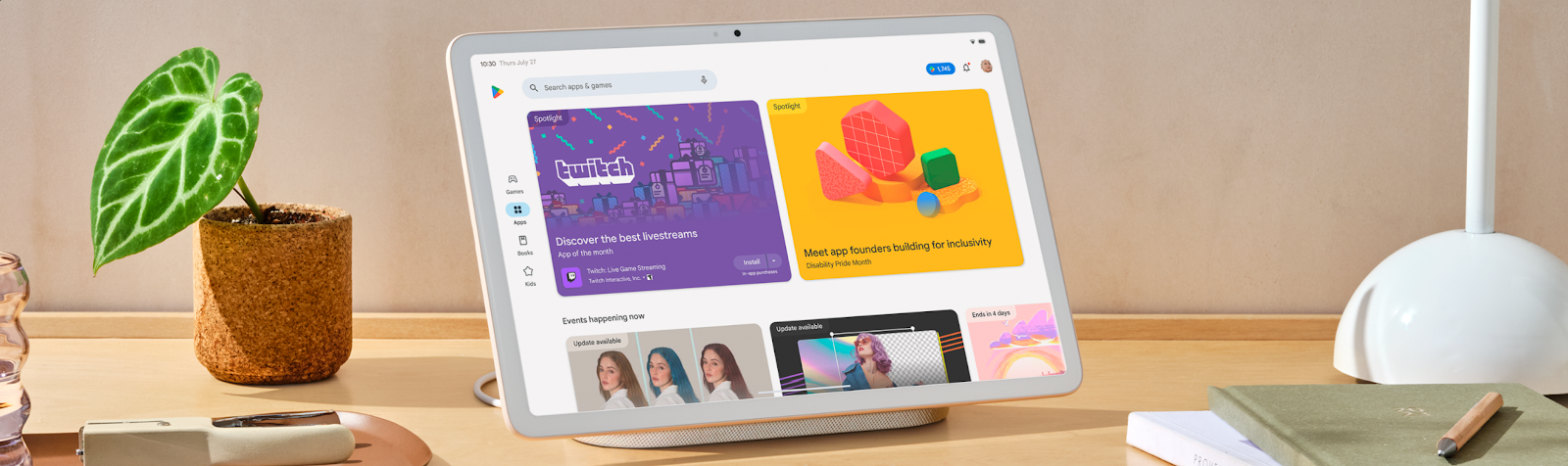
Even the splash screenshot is, what the fuck? Two giant “blogspot” blocks and two and a half “event” blocks are visible in the Apps view. Is that supposed to be the tablet UI?
Deranking apps that don’t scale well with tablets should hopefully push more companies to get that sorted
I haven’t used an Android tablet in a long while I recall Google being among the worst offenders back in the day!
I recently started a tablet I hadn’t touched in 2 years. Updated the apps to the latest version and somehow Gmail is worse than the version 2 years ago! There was a nice side bar which doesn’t exist any more. I have no idea wtf they’re doing even now…
huh, the first play store update I’ve seen in a while that’s actually good? What times we live in
That raises a good question… when was the last one? I don’t remember being excited for a Play Store update myself.
Hopefully this also makes it to ChromeOS given they leaned towards the “large screen devices” wording. Would make browsing easier.
I think “large screen” is used to encompass tablets and foldables, but ChromeOS has had it’s own unique interface for a while now
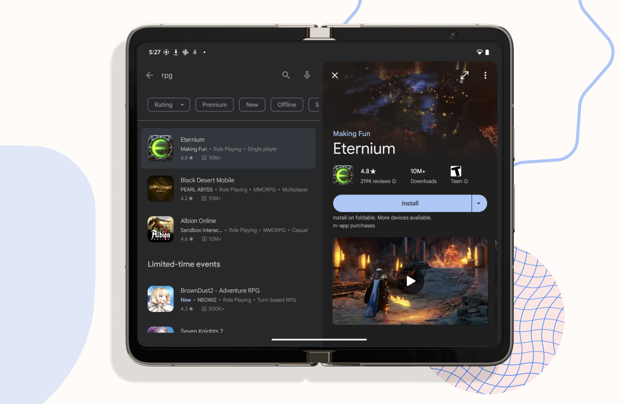
Yeah, you’re likely right but it would be nice to see some improvements like the split screen search shown or the web version. Right now everything is in one column which seems like a waste of space.
Interesting, I saw some of this UI on my Android TV last week. Unsure if that’s how it’s always been or if they were doing some A/B testing. It was refreshing to use a UI that was intuitive, NGL.
I got a little excited for Android TV when I saw “big screens.”
I think I got this a couple weeks ago as part of AB testing. I liked it a lot until it was taken away again.