
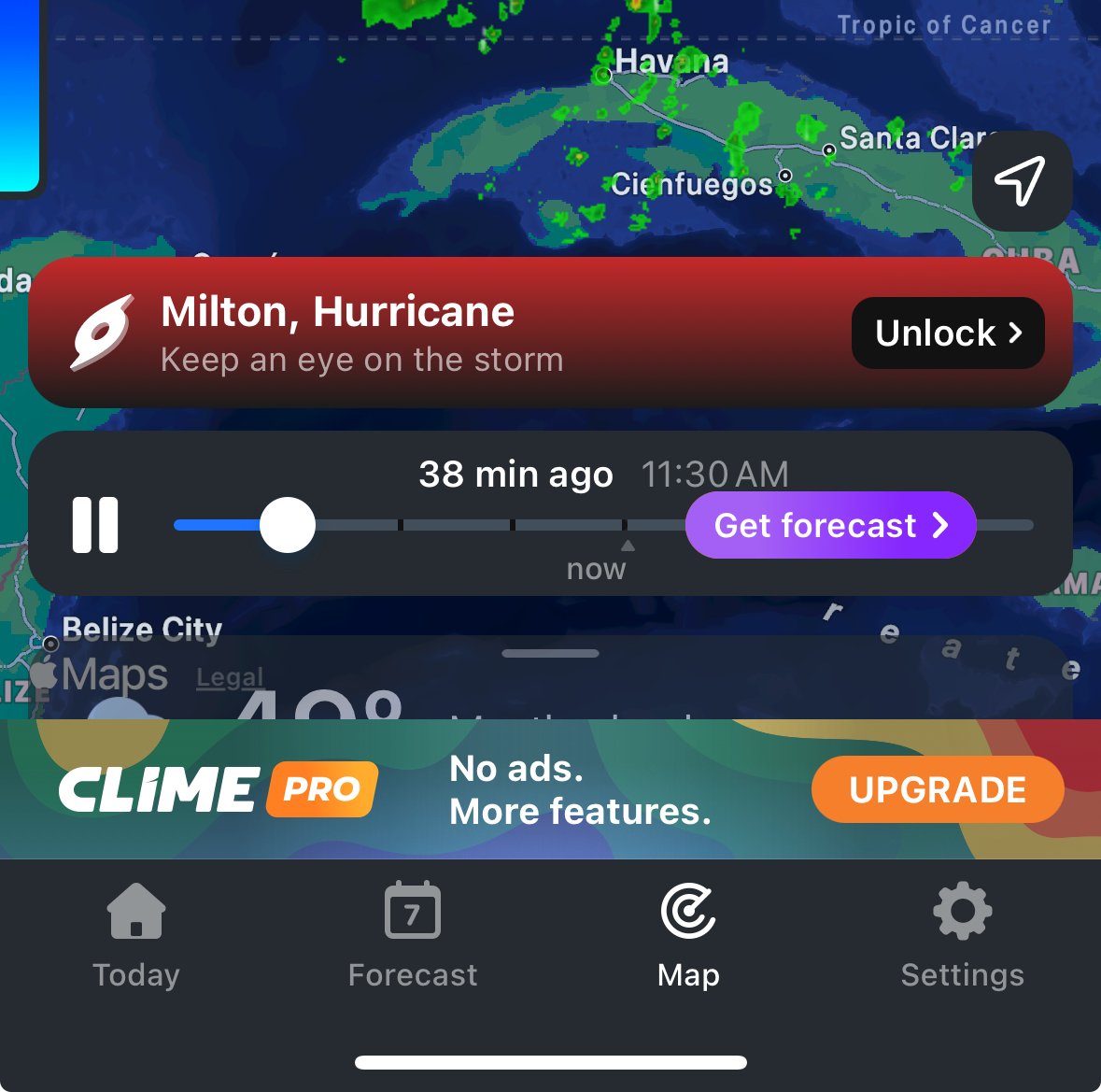
The app is Clime Pro on iOS, they lock full access to Hurricane Milton data behind a $10 USD per week paywall.
If you’re in the area impacted by Milton, you can find publicly available resources at the National Hurricane Center’s website: National Hurricane Center
In a hypothetical world where everyone has every comfort available and every need met,
in that world at least,
I could say:
“There is some room for wrapping something in a sleek package!“
(Maybe I’d pay a dollar if someone remade those graphs really beautifully)
I only ever check my weather on NWS, but a year or two ago they went from having easily read hourly forecast data to those obnoxious graphs. I have zero clue why they did that.
If you click on the graph, it’ll turn into a data table showing ~48 hours worth of information. Is that what you’re looking for?
Holy shit, you’re awesome! Seriously, thank you haha, that makes readability so much faster.
Meteorologists do those graphs. What do you expect. Having set through more than one lecture by NOAA person for certification as a weather watch person as a firefighter. They love graphs and photos of clouds. Sooooo many photos of clouds…
Still, they are easy enough to read once you get used to them.
Oh for sure, I get that. But the NWS website is still meant for the public to use, and the old design layout was simpler and faster to read. Some folks might read graphs faster/as fast, but not for many of us. Regardless, another user pointed out you can click on the graph and it converts it all into an easy to read table format. :)