
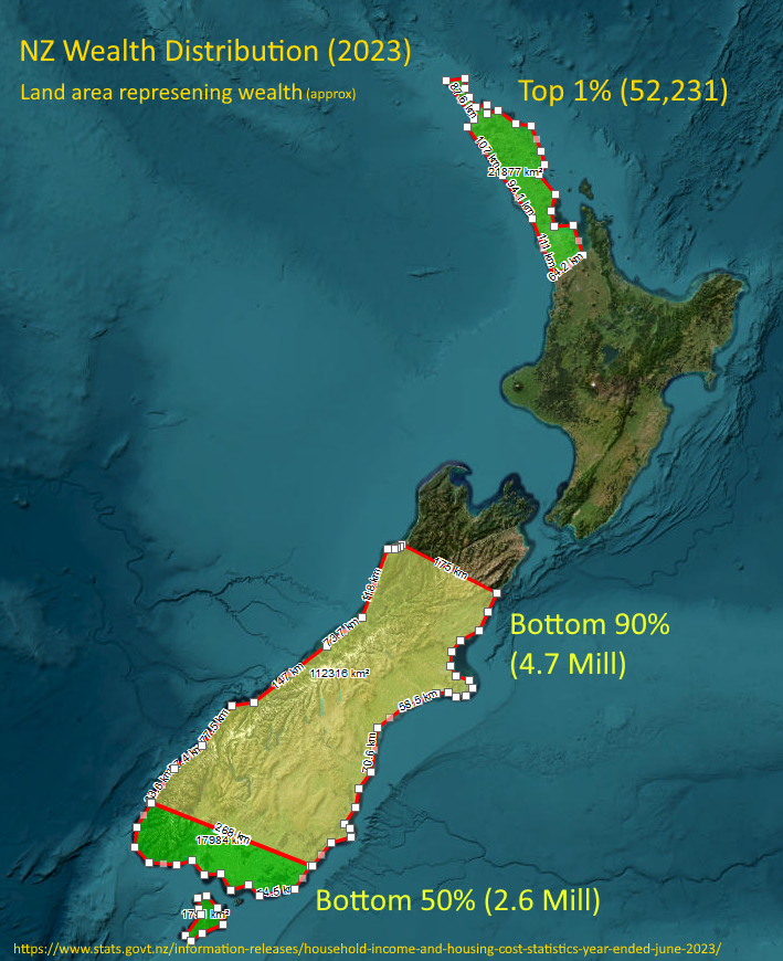
After seeing something similar elsewhere I decided to give this a go.
Honestly, I thought the top 1% (population the size of Hastings) might reach down to Whangarei or at most upper-upper Auckland, but it’s the visual representation of the top 10% - basically everything north of about Kaikoura - that shocked me the most!
It has nothing to do with population density as far as I can see.
It’s a stacked column that OP has put in the shape of NZ using land area as a percentage of column.
Regional wealth distribution maps look very different.