
After seeing something similar elsewhere I decided to give this a go.
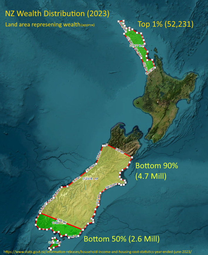
Honestly, I thought the top 1% (population the size of Hastings) might reach down to Whangarei or at most upper-upper Auckland, but it’s the visual representation of the top 10% - basically everything north of about Kaikoura - that shocked me the most!
I thought it was a fun idea. People would get the point if the whole thing was coloured and the lines between zones were horizontal, but land area for that would be harder to calculate.