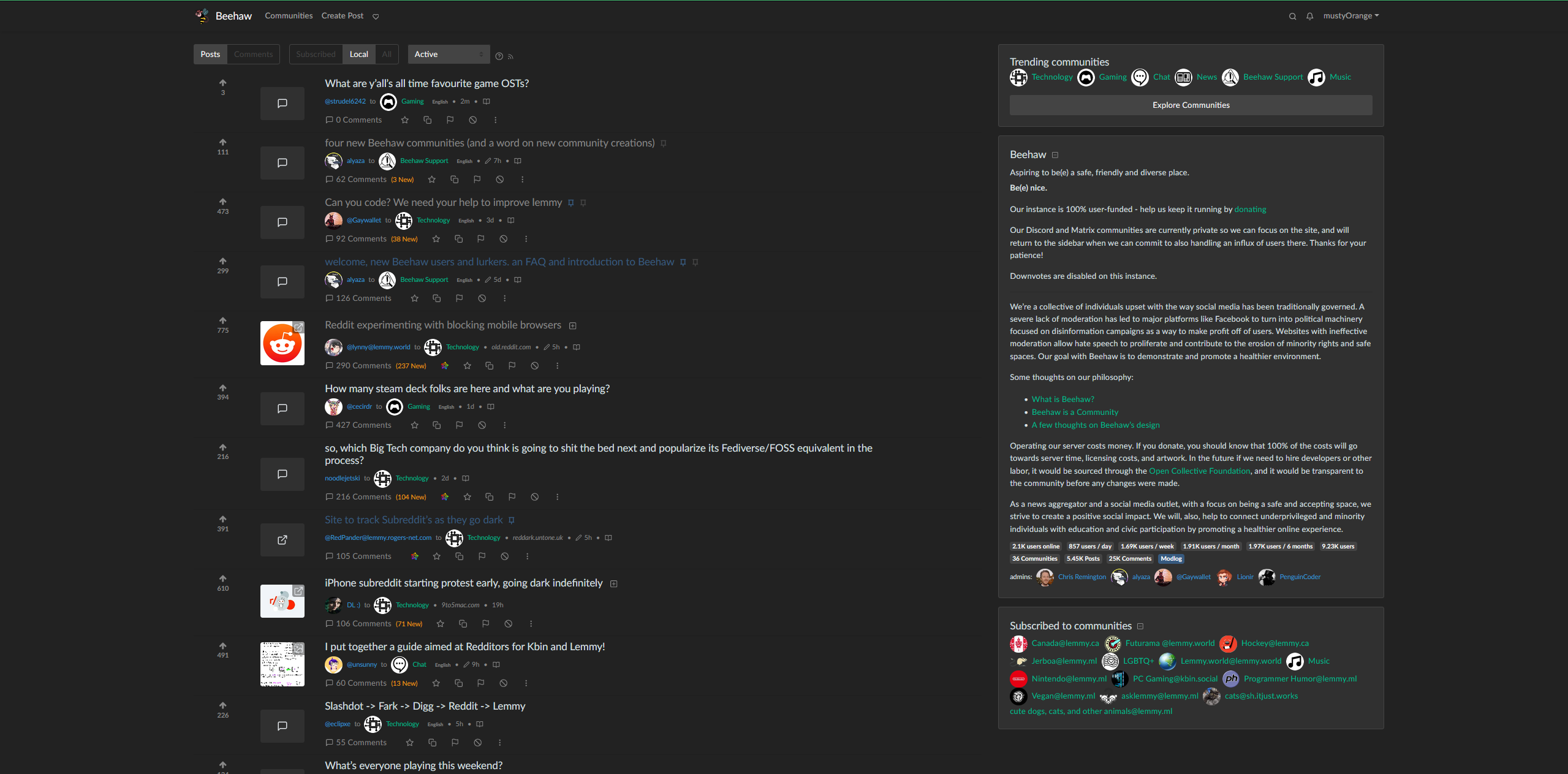
Not sure if this is the right community, but the narrowness of the default web page was driving me a little crazy. I still need to fix a few things (like vertically centering the votes) but I feel that this looks a lot better. If you have the Stylus browser add on, you should just be able to copy and paste this into a new style
@media (min-width:1400px) {
       .container,
       .container-lg,
       .container-md,
       .container-sm,
       .container-xl {
           max-width: 2200px;
       }
       .col-sm-2 {
           flex: 0 0 8%;
           max-width: 8%;
           display: flex;
           align-items: center;
           text-align: center;
       }
   }

   h5 {
       margin-bottom: .05rem!important;
   }
   .thumbnail {
       object-fit: cover;
       min-height: 60px;
       max-height: 80px;
       max-width: 80px;
       min-width: 80px;
       width: 100%;
   }
   .btn-block {
       margin-top: 1rem!important;
   }
   .mb-1,
   .my-1 {
       margin-top: .3rem!important;
       margin-bottom: .3rem!important;
   }
   .my-3 {
       margin-top: .3rem!important;
       margin-bottom: .5rem!important;
   }

   .vote-bar {
       min-width: 80px;
   }

deleted by creator
Bless you. Honestly the UI is the biggest thing that’s making trying to stay on this nice community difficult! old.reddit had a UI that felt very comfortable to read, while Lemmy is… less so, for some reason. I hope it improves in general.
Any idea on how to make a compact view? I am kinda new to css and miss old UIs.
Any plans for Beehaw to just fork Lemmy and start applying these quick fixes?
No clue, Im not a mod haha. I hope it wouldnt be too hard to change locally for beehaw - small stuff like this could keep people from going to kbin, which currently has a much better front page ui. Honestly, Im surprised the main lemmy branch has as shitty a front end as it does. Im a back end web dev, and it bothers me, which means it could use a lot of work lol


