
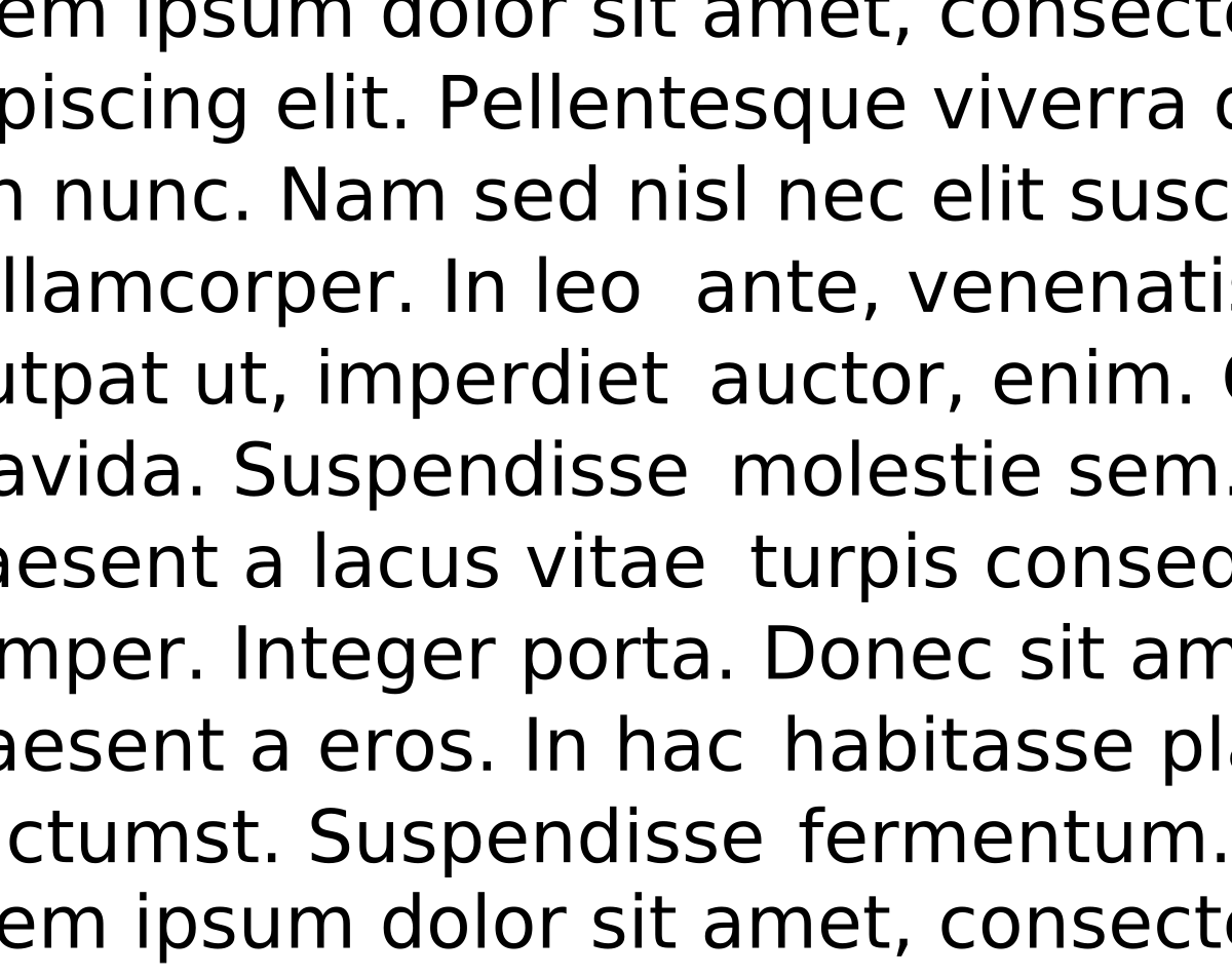
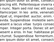
In typography, rivers (or rivers of white) are gaps in typesetting which appear to run through a paragraph of text due to a coincidental alignment of spaces. Rivers can occur regardless of the spacing settings, but are most noticeable with wide inter-word spaces caused by full text justification or monospaced fonts. Rivers are less noticeable with proportional fonts, due to narrow spacing. Another cause of rivers is the close repetition of a long word or similar words at regular intervals, such as “maximization” with “minimization” or “optimization”.
Ok.
That’s one more 40 year old question I had, that I can now cross off my list.
Had no idea this had a name. Very happy to find out that it does!
I’ve definitely noticed it, but had no Idea it had a name or that editors would take steps to avoid it. Kinda neat OP.
Learned about it from the comments of this post: https://lemmy.ca/post/19811769
Cool! Thanks for crediting original thread!
test reply
Now I want to have written a book that utilised this to set the scenery. Let’s see the translators deal with that!
House of Leaves uses a bunch of gimmicks like this… Kind of forget if he used “rivers” specifically, but I’d be kind of surprised if he hadn’t.
Let me take you back to punched card days, when people would design patterns and shapes using different characters, a single line at a time (one card, one line of 80 characters).
When the cards were just printed (to a nice, noisy, dot-matrix), you’d see the image they designed.
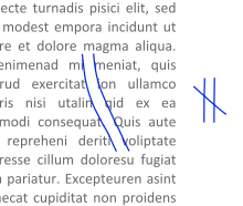
I would always squint my eyes and try to see pictures in the ‘rivers’
I see this reading book on my tablet! Had no idea there was a name for it. When I’m really tired it’s distracting.