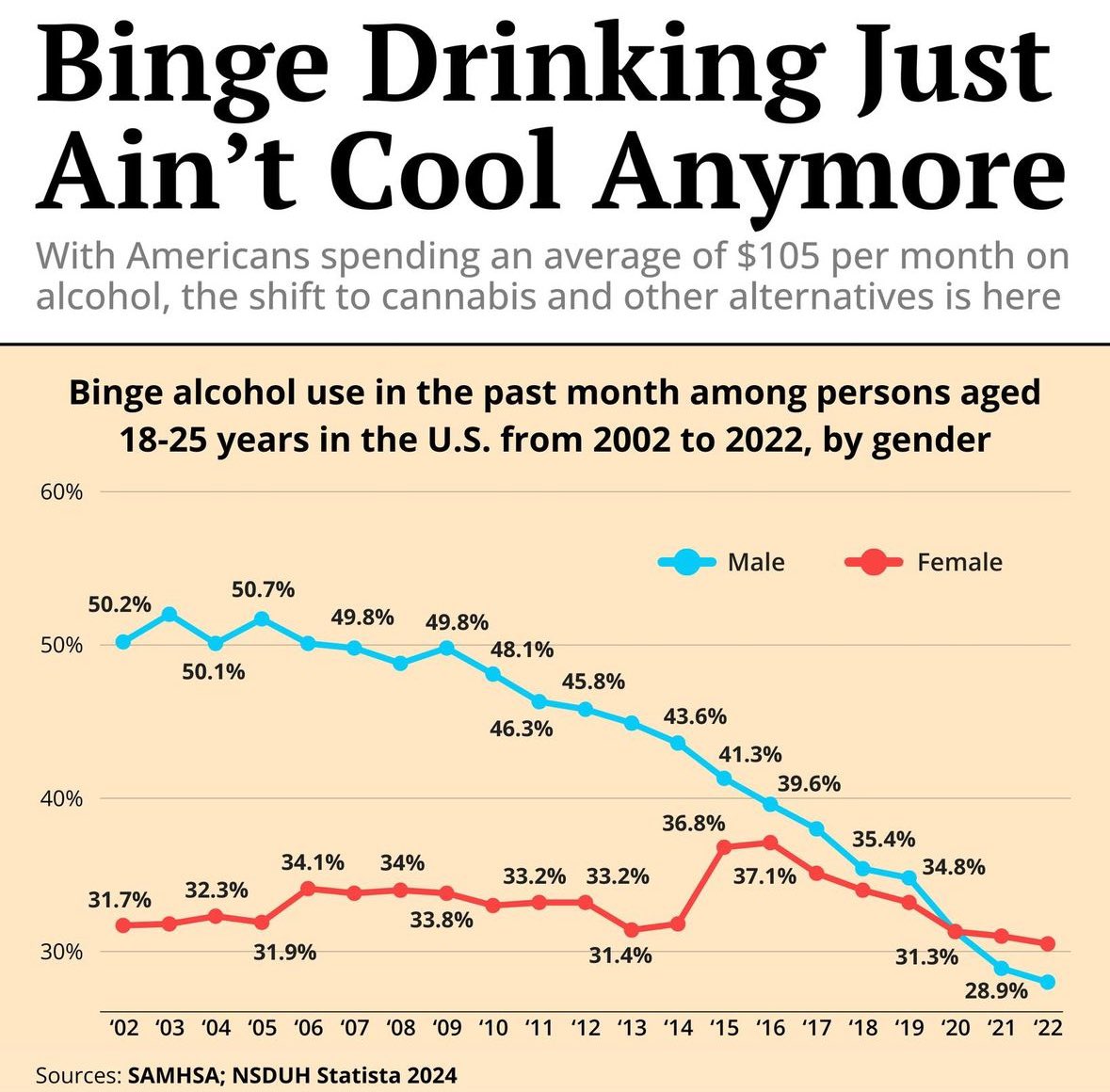
The Picard Maneuver@lemmy.world to Data is Beautiful@lemmy.worldEnglish · 3 months agoBinge alcohol use in the past month among persons aged 18-25 years in the U.S. from 2002 to 2022, by genderlemmy.worldimagemessage-square101fedilinkarrow-up1515arrow-down114
arrow-up1501arrow-down1imageBinge alcohol use in the past month among persons aged 18-25 years in the U.S. from 2002 to 2022, by genderlemmy.worldThe Picard Maneuver@lemmy.world to Data is Beautiful@lemmy.worldEnglish · 3 months agomessage-square101fedilink
minus-squarezaphod@sopuli.xyzlinkfedilinkEnglisharrow-up27arrow-down2·3 months agoYeah, graphs that are cut off is misleading graphs 101.
minus-squareDragonTypeWyvern@midwest.sociallinkfedilinkEnglisharrow-up22·3 months agoSometimes you just have to trust the audience to be literate. A 20% drop is very significant, it’s not like they’re trying to make a .5% decline look like the Temperance movement.
minus-squareGoldmage263@sh.itjust.workslinkfedilinkEnglisharrow-up6arrow-down1·3 months ago Trust the audience to be literate But really, that depends on the intended audience.

Yeah, graphs that are cut off is misleading graphs 101.
Sometimes you just have to trust the audience to be literate. A 20% drop is very significant, it’s not like they’re trying to make a .5% decline look like the Temperance movement.
But really, that depends on the intended audience.