I don’t want to visit reddit, so I came here; Yet this community seems so small. I wanna ask how to build something that is not ugly mess, is it fine to ask it here? Would the Minecraft Forum be a better place for this?
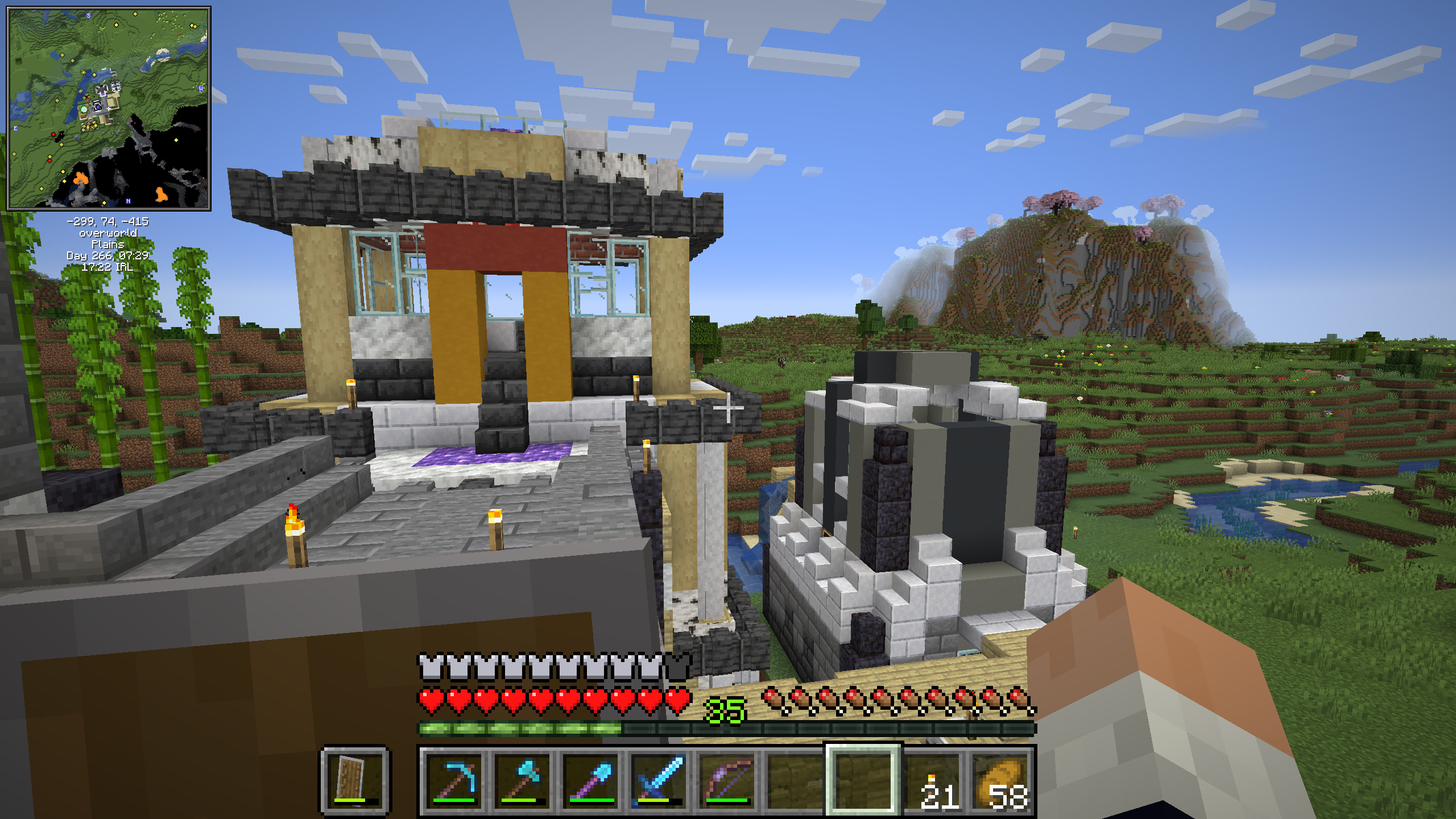
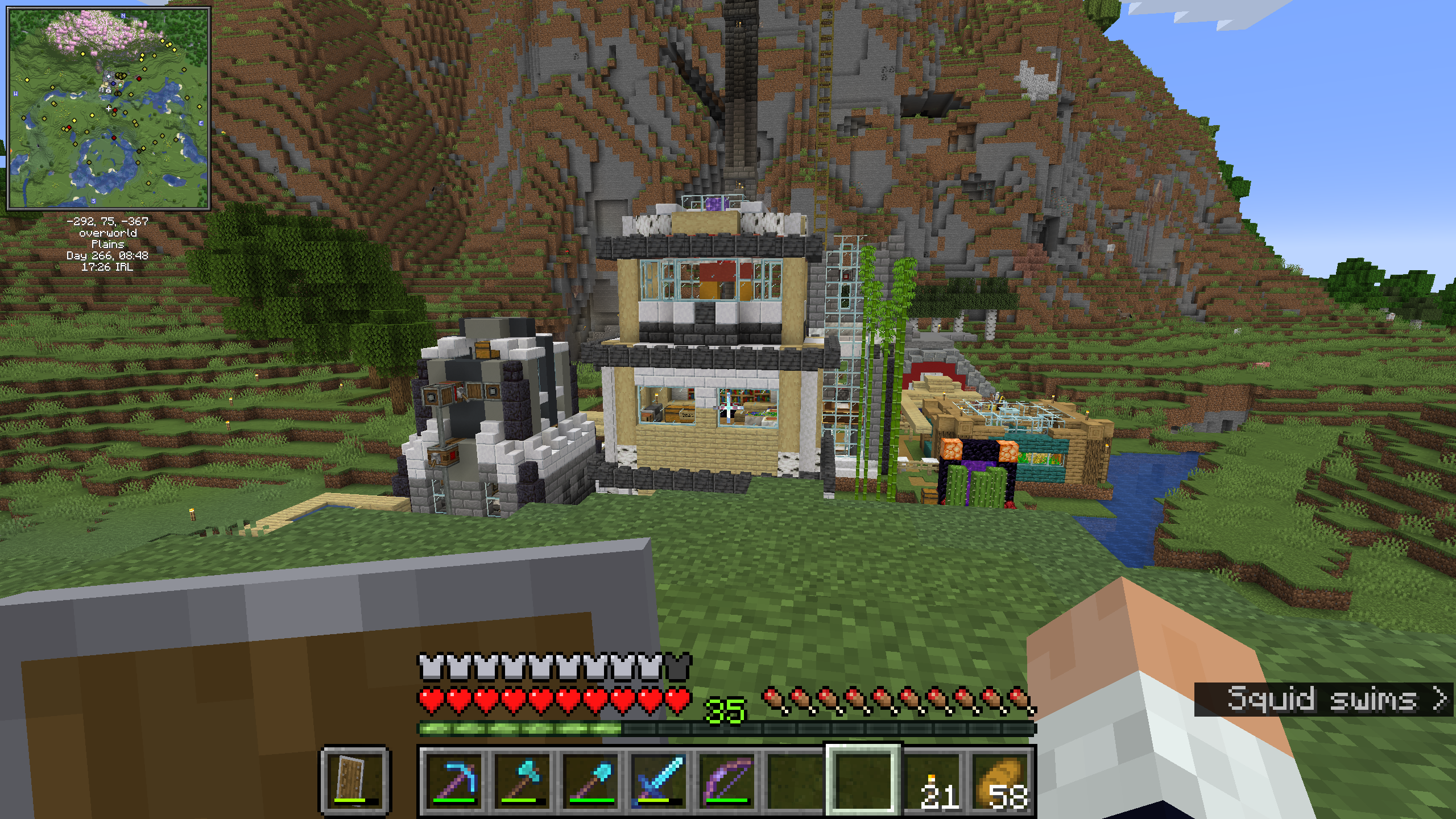
EDIT: Added the screenshots of my atrocious buildings.


It would be better if you shared a pic of that “ugly mess”. That said I think that it should be fine (rule-wise) to ask it here.
For now, tips that I can give you:
- Focus on a theme for that build. The simpler the theme, the easier to get.
- Find good combos of blocks, and use them somewhat consistently for a feature of your build. For example: I personally like building walls with stone bricks + wood (it’s cheap for survival, and it looks good), while the roof is mostly Nether bricks;
- Don’t fight against the terrain. Some terraforming is fine; but flatting it all out will make your build look out of place.
- Use pictures for reference. Copying is 90% of creating.
- Too much detail is as bad as too little. Find a good balance.
Ah yeah, thanks a lot! I’ll post screenshots when I got time
Posted screenshot, could you take some look id you got time?
It is not so bad that it’s an “ugly mess”. It’s simply cluttered. The shape looks good even if a bit weird, the issue are your choices of blocks, they’re clashing with each other, and you’re using a lot of different types so it’s really hard to combo them.
I’d suggest you to make a creative mode copy of your world and try the following, see if you like the results:
- Replace those birch logs with spruce, so they contrast better with the birch planks. Either keep them all with their bark, or remove it from all of them. If you feel that the build becomes too colourless, barkless acacia logs are also an option.
- Replace the yellow and red concrete with the same type of log that you picked above.
- Pick one between basalt, plain stone, or that white stone (I think that it’s modded marble?). The mix is fine in the right building because it’s just stone, but when you’re combining it with other elements it’s making it look too busy.
- I’m not too hot on the usage of concrete + bricks like you did in the right. Perhaps it would be better to stick to one or another.
- That amethyst doormat needs to go. It makes your sight gravitate towards the floor.
- Consider replacing those torches in the building with lanterns, hanging from the roof. The ones nearer to you are a bit trickier, I’d probably try to replace them with froglight or shroomlights.
I see, I was trying to be too clever with the build. Let me reduce the number of selections being used in the build.
Sometimes less is more. (And sometimes more is more. It… depends, really.)
I like the shape, though. A lot of people struggle giving their buildings depth, but you did it rather well.
Just post pictures or a video or whatever there’s not need to ask permission first.
To be honest, I see this sometimes from people who are new from Reddit and are probably used to power tripping mods deleting their shit for not crossing T and dotting every I.
When I’m unsure about how tackle a build I use reference images from Google or Pinterest, sometimes completely copying them and other times combining different elements of builds together to make something new.
I imagine it’s fine to ask for a critique. Where I think it starts becoming an issue, however, is if people spam the community for every little detail through multiple posts.
I learned this technique from a video, I don’t remember who the author was.
Their idea is to start by building hollow cubes of somewhat random sizes, each connecting to the other and possibly merging (some parts of a cube inside others). Once you have enough cubes, you use those as the skeleton to build the final structure. Square-ish cubes become rooms, tall and skinny cubes can become stairs, really big cubes can be multi-floor open areas. The hollow cubes act as a canvas with structure, so that you can “paint” your build on something more than just empty air.
In general, there’s a tutorial on the Minecraft wiki just for adding beauty to constructions, and the Construction category on the tutorial page has other tutorials for buildings too.
There is a guide I used to swear by on minecraftforum.net, might be this one but I think it was longer
Not that I’m any good at building, but a common strategy I’ve seen on various YouTube channels is to have a rough reference picture for what you’re working towards. An image search for something and adding the word concept or concept sketch usually gives back something good. It helps you remember the final look you’re after.
Eg. Image search for desert castle concept
Nb. Ignore the sarcasm at the link, just using it to explain what I mean


