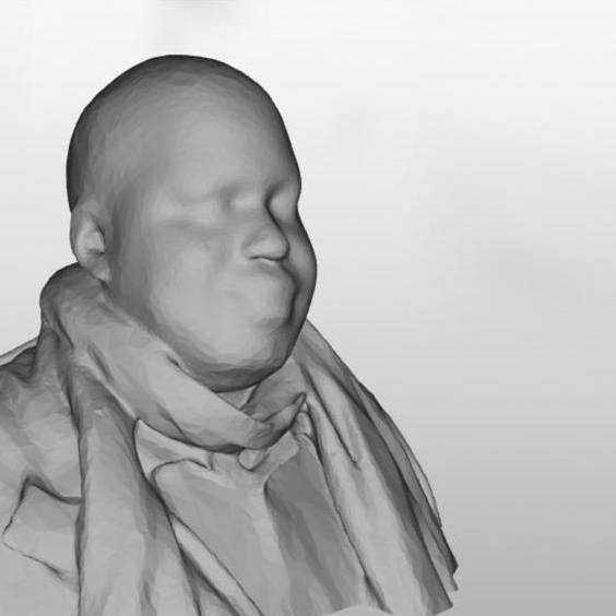
Actually wtf is that, that’s insane
I think this is the right system:
pedestrians > bicycles > cars
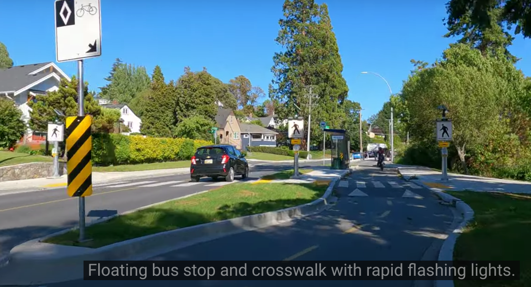
But this is whats in the picture:
cars > pedestrians > bicycles
From this limited view pedestrians seem to have a pretty nice place there. Crosswalks are highlighted strongly and there’s no traffic lights to slow down pedestrians so they have the priority and the necessary attention. Sidwalks seem wide enough as well.
Yes the road is wider than the bike path, but they each have one lane per direction and there don’t appear to be any sharp turns. The bike lane should perhaps be a little wider, but if there’s only a low number of cyclers it seems equal-ish.
I feel like the little “hill” where the bike lanes and crosswalk intersect should start earlier, that way bikes could come to a halt at the top of the hill and wouldn’t have to accelerate through it, instead they could use it as a sort of break to build up potential energy for a little speed boost later on. Either way the hill seems like a decent idea considering bike drivers occasionally try to drive past pedestrians without a clear path, overestimating their agility - especially at high speeds.
While one could argue for a similar hill on the road, I’d consider that an unnecessary nuisance for the bus driver and passengers. Being shaken around while getting up for a stop is not a nice experience. A hill would also scratch the underside of a low-floor bus.
Ideally bus and tram stops should probably be placed just before a crossing, not after. That way the bus doesn’t block view of pedestrians for cars coming from the opposite direction. The bus driver will usually have to stop for the station either way, so might as well combine the stop for the station with the stop for the crosswalk.
That said I’d argue it’s more of a pedestrians > cars > bicycles or maybe even a pedestrians > cars/bycycles system. Not quite as bad as your suggestion, but still not ideal.
edits: Added a comment about bus stop location. Added comment on low-floor bus.
It looks overengineered and I am not sure it is more safe for pedestrians, bicycles or cars.
I have seen that kind of design near public transport hubs when the bus stop services many busses and there’s a constant stream of traffic of all types. This one on the other hand will be ignored by all.
What exactly do you consider insane about it?
Which, by virtue of not reducing its speed, is more likely to seriously injure a pedestrian: a car, or a bicycle?
It’s called a level crossing in this case. The purpose of a level crossing is for safety of pedestrians and makes perfect sense. The only problem here is as the title says, that they didn’t do it for the street as well. Nothing wrong with the one in the bikeway.
It’s also an accessibility feature so people don’t have to do the invariable up and down from kerbs into the road when using mobility aids or pushchairs with kids/shopping etc
This appears to be a case of “best practices” that’s perhaps so good it’s excessive when put together. I’ll try to explain as succinctly as I can.
As you can see in these two examples, having the pedestrian crosswalk to a bus stop raised where it crosses the bike lane is a standard design. The floating bus island reduces bus-bike conflict and speeds up bus time by removing the need to merge in and out of the travel lane. Meanwhile it also preserves the protected bike lane and, depending on design, gives folks waiting for the bus a nice space not immediately next to automotive traffic to sit/stand. However this design introduces potential pedestrian-bike conflict, especially in urban contexts where road space is cramped, visibility is poor, and/or people exiting the bus or moving from the sidewalk to the bus island do not have a lot of space and may unexpectedly (from the perspective of bike riders) enter the bike lane. Rushing to catch a bus that’s about to depart especially can cause people to have blinders and suddenly enter into the bike lane without looking because they’re too focused on the bus. For accessibility reasons it’s best to have the path across the bike lane raised to sidewalk level but only for the duration of the crossing (otherwise you end up with people walking or even standing around waiting in the bike lane).
Finally there’s the fragile political alignment of people on foot and people on bicycles; these two groups should be allies in the fight against car dominance but our road and even recreational systems have often pitted the two against each other: it’s very common to hear pedestrians especially complain about near-misses with bicycles, particularly on shared paths (“I was walking my dog and this speeding cyclist appeared out of nowhere and almost ran us over!” “I was riding my bike and this inattentive pedestrian’s dog abruptly jumped into my path and I had to swerve to avoid them both!”). Reducing conflict between these two groups of road users to keep them allied is critical for political reasons in many places, and this means slowing cycling speed near the conflict zone (via the speed bump) while also keeping the conflict zone reduced to just one or maybe two specific crossing areas (indicated by the elevated crossing).
All the above seems like overkill in the example cited above because these “best practices” were designed for cramped urban environments, such as major automotive corridors with multiple lanes through city centers that recently had a lane or two converted to bike/bus/ped infrastructure via a major “road diet” or bus enhancement project. But here there’s a huge bus island, an extra wide bike lane (because it’s for two-way use), great visibility, the waiting area is on the bus island rather than the sidewalk, etc. so while these best practices probably are still effective, they aren’t as necessary for reducing bike-ped conflict as in other contexts. As to why there’s no speed bump in the automotive lanes, the bus island itself may provide sufficient traffic calming by breaking up the monotony of the roadway, and most importantly, a speed bump would greatly reduce comfort of bus riders. Speed bumps are not meant as “punishment” to one form of transportation or another; they’re a tool that’s only rolled out to solve a specific issue.
I hope this helps explain why this spot is designed as it is, and why this is a poor example of “unfair” road design.
Nothing to add, just appreciate the write up! Informative AF
Holy fuck! What an epic post. Top tier!
Best practice for pedestrians is to have a raised single lane crossing through car traffic. Or to have a protected area in the middle of the two lanes if single lane crossing isn’t possible. They had these all over Iceland and they were amazing.
A raised area over bikes but not cars does nothing to help pedestrians. That is a gross misunderstanding of a best practice at best
Pretty sure this is for safety, so cars don’t drive on the bike way doing 60.
I’d agree, put the speed bump for the car and not in the bike lane and you’ll easily get impatient people dipping into that wide car sized bike lane to avoid slowing down.
You guys get bike lanes?
fuck cars.
Car supremecy is when there are no options but cars, and I live there.
That’s just so you can get some sick air.
this is THE first time I’ve seen a link to a mastodon page anywhere on my lemmy feed. insane


