We reached the point (some time ago) where the save icon being a floppy disk makes absolutely no sense to anyone born after a certain time. We could choose a more modern media format and use an icon of that instead, but we would run into the same problem once that media becomes obsolete.
What is a good icon for the function of saving something that can easily be understood by anyone regardless of language or the march of time?
Edit: I know it’s not really an answerable question and is hard but the question is what would you come up with if tasks to design an icon. Given the constraints of the question, what are your best shots at coming up with something that fills the requirements and why do you thing it would work?
Maybe something like a document going into a safe? As things are increasingly digital, both of those technologies become somewhat less relevant. On the other hand, one could go with 保存 on a button. Chinese and Japanese speakers will instantly know what it does. Others could learn. At some point, kanji are just slightly more complex squiggles to represent an increasingly non-concrete thing.
📖
How are there so many people ITT who genuinely don’t even understand what OP is asking and are arguing about something else completely that they thought up in their head like whether we should do away with the floppy icon because it confuses people now or if their youngsters know what a floppy is or if they do or if there’s a better icon to us now that can represent saving.
None of those are anything to do with OP really.
What OP is asking is if in 10000 years the next human civilization after our collapse that has no concept of computers and probably no electricity or industry nor potentially any grasp on our language or alphabet stumbles upon a functioning computer from our civilization, how do we tell them which button is the save button, when all shared symbolic context has been lost?
Consider the same question but for radioactive waste, how do we ward off potential future pre-industrial human civilizations from our nuclear waste sites to stop them dying to radiation poisoning for possibly tens of thousands of years until they develop an understanding of radiation and the equipment to measure it? Well, something like this maybe:
https://en.m.wikipedia.org/wiki/Long-term_nuclear_waste_warning_messages
Though maybe given this thread, we should instead be considering how to convey very simple abstract questions to the pre-industrial people on lemmy.world instead, especially when it appears they have only a rudimentary, GPT2-esque grasp on language.
k
I am also very perplexed by the responses in this whole thread. These are very basic drills that are also done in design based classes. It’s just a thought experiment.
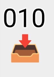
How about something like that? Symbolises data to device.
that’s an in/outbox for paper documents.
Yeah, I just used what icon was handy. I mean if you were to do a more serious attempt,I’d draw it more like a concrete box, myself. Or more specifically concrete slots that line up with the numbers, driving home the point that it is a more permanent solution.
Are you going for just updating? If so, I’d leave it alone. Culturally it’s ubiquitous and doesn’t require changing.
If you’re thinking more along the lines of a save version of the whole “how do we ensure future people know nuclear waste resides within” then you’re gonna run into the same problems they do, symbols change meaning over time. But if I had to pick something that may be obvious to most people, my vote is a scribe and a pen. Most cultures have writing, most cultures with writing save information by writing it down. There are problems, obviously, but if you gotta pick one, that’s my vote until I hear a better suggestion.
And for what it’s worth, with the nuclear waste sitch, my vote first the atomic priesthood
Floppy disk. Fight me.
Agreed. It’s the tried and true icon.
It’s like on discord, what’s the symbol to make a call? An old school telephone handset. People know what it means. It’s a universal symbol
People have stopped recognizing it as a disk (which is good because that meaning was always pretty confusing in terms of saving vs loading) it is now the save symbol and will continue to be the save symbol centuries after the last floppy disk has crumbled into ash.
Similarly, the folder icon has now been enshrined as load.
Why is the disk save and the folder load? It’s completely fucking arbitrary, both worked just as well for each context. But someone somewhere (probably in the MSFT internationalization and standards team tbh) made that choice once and thus it is that forever.
Yeah there is no reason at this point to change it as we just teach people that the floppy disk means save. I was wondering if we could come up with something that the user, at a glance, would generally identify as saving. What would that glyph look like. In other words, the arbitrary and established icon is what it is but with hindsight and thinking ahead what would be a better icon we could design. One that would convey “save” to the most people the first time they see it.
The act of loading necessitates a selection, so the folder makes more sense.
No more so than saving. Either saving and loading use free filesystem browsing interfaces, slots that are embedded into a single file/non-descreet location on disk, or they save into a limited scope of files/folders on disk. The last system seems to be the most common in modern UX within non-compatible apps with the first system being preferred for apps dealing with common files (like a text editor).
Also, there is a whole thing with Save As vs. Save - though with a new file/profile/whatever Save can often trigger a Save As action.
Most saving is done on files that already exist.
That’s a fair answer. There is nothing saying the floppy disk can’t work. By sticking with a symbol that has no actual bearing on function (from the perspective of the future people) you’ve abstracted the concept of saving away from natural language. However, you still place a computational burden on those future people/aliens/whatever where they need to be taught what that icon means.
“I have updated the save icon from a floppy disk to a CD-ROM.”
Almost none of our symbols make sense and are disconnected from their origin. That’s a good thing. Without detachment of the signs from their reference we can’t have abstract thought and language. The letter D comes from an icon for fish. But it went from indexical reference to icon, to symbol. And then we changed its shape over time to what it is today, and some people started using it for the alveolar plosive. The same has happened for every single symbol we recognize and use, alphabet or not. It’s all arbitrary and it doesn’t matter if we don’t use actual floppy disks anymore.
This is all true but given the charge of creating a new icon that would be the “most recognizable” as save to the most people the first time they see it, what would that look like. The question is impossible to answer with a single thing as it’s too vast and everything becomes meaningless eventually. But given everything we know of languages, the brain, how we perceive things, what would be a better icon we could design?
You can’t design a better icon. That’s not how symbolism works. The most recognizable symbol for save is the one we are using now. As designing something new, by default, it would not be recognized by anyone but the designer since use defines meaning. Until it is used it won’t be recognized by anyone.
Edit: like, think of the play icon and its meaning in media control. It was born as an indicator of the direction a reel to reel tape player was moving. It still holds that meaning for digital streaming today despite the virtual extinction of tape players. Its use defines its meaning, detached from its origin and despite the obsolescence of its reference.
Not necessarily. I can see an icon with some randomly-sized vertical lines and think of rain. Or an icon might have a mountain peak silhouhette that generates a random mountain peak. Symbolism doesn’t work in the sense we can’t just design something but I’d argue we could probably come up with something that is at least indicative of saving to people regardless of language. Obviously the floppy fills that for now but if we could go back and drive the adoption of the icon, what icon could we create that would most indicate saving to people regardless of technology.
(I understand there isn’t a correct answer to this, just wanted to read people’s thoughts on ideas)
A friend was a design teacher and he taught me that design uses existing symbolism and iconography. But you can’t control what people will ultimately use your design for. The babadook for example, was a monster intended to cause fear in a horror movie. However, a clerical error by Netflix and an over imaginative tumblr user, turned it into a queer icon that is now widely recognized on internet culture. Of course you can sort of imbue intent and predict use of design to some extent, but humans have an arbitrary side that makes it hard to say something would be a better icon for an abstract concept.
It’s a floppy disk. Which is the universal icon for saving, the same way a red light is a universal symbol for “stop”.
You underestimate the power of arbitrary symbols. Welcome to all of human semiotics.
No I get that but I’m asking that given what we know about symbols and how we process information, what would be a better icon that can indicate save without having to be taught? There is clearly no right answer here but is it even possible to create something that would work? Things like rain or clouds we can do because there we can see examples. Is there anything that indicates saving we could come up with?
Probably not. We use a kebab or a hamburger to mean “tap here for a menu” for some reason
The symbol is meant to represent line items on a menu. It’s referred to as “hamburger” because it’s whimsical, Leland.
don’t change the floppy :( once nobody speaks of it, it truly dies
Not quite dead yet. This seismic survey ship I was 9n fairly recently… we had generated the navigational data, and needed to feed it into the ships autopilot. This was done via floppy.
Yes, it was a relatively old ship (late 90’s, I think), but there are plenty older ones around. And even when refurbishing a ship, they often leave the autopilot alone.
Yeah I probably should have qualified that with, “unless you’re a municipal/city/state transportation system or in maritime.”
Or pretty much anywhere in the manufacturing sector.
Plenty of products you use on a daily basis, especially processed foods, are being cranked out on equipment controlled by PLC’s from the 1980’s or earlier.
Don’t worry, your wife still will.
We should just start manufacturing NVME drives to look like floppy disks.
I feel like the shape mostly doesn’t matter, as most people will never see or physically interact with an NVME drive. It’s just “the files are inside the computer.”
It won’t solve anything, but we should do it for fun, though.
I’ve noticed youngsters where I work sometimes no longer know what “saving a document is”, as they only know google doc style sync.
So I’d go with a send button: send to harddrive. Usually represented with an triangle/arrow.
Send/share buttons are already a fucking mess though
I think that’s more of a UX issue than an issue of iconography, though. Could-synched stuff synchs in the background, so there’s just no interaction involved.
I don’t know how far down that road it’ll go, but I wonder if eventually the concept of “checkpointing” in games becomes more frequent than old document saving and that’s how we think about version control going forward.
You’re asking for an abstract indicator of a concept. You might as well be trying to draw ‘dignity’.
Everything else will become obsolete with time, and that’s not necessarily a bad thing. We have countless icons that have long since been separated from their original meanings. The need for it to be intuitive is when the concept is new, not as it changes.
Yeah you’re right, but I think it will be interesting to hear what people come up with. It’s similar to the nuclear waste warnings. Wikipedia Nuclear Waste Warnings

This is how ancient Egyptians prepared their dead
“Upload to Wetware”
Interesting concept, attempting to indicate something entering the brain/head/statefulness. I wonder if we could generalize it further so that race of underground mole-people would understand it as well (e.g. not a species-specific head).
A pencil writing on paper.
Assuming we’re talking about “anyone” including a post-collapse society or an alien race that never invented the floppy, and sufficiently advanced to competently use a computer. The most basic means of recording information is to use an implement to create marks on a surface. You can draw lines in the sand, or indentations on a clay tablet, or scratches on a lead sheet, or lines on a paper, the method usually involves a flat surface and a pointy object leaving visible lines. The symbolic representation of a pencil and paper is sufficiently generic that most people will associate it with committing information to a non-volatile medium.
That’s “Edit”
Or “New”? Fuck
Yeah I think something along those lines is probably what we’d end up with. We couldn’t do something that is truly universally understood to mean save but I think we’d get a large percentage of users who would make the connection instinctively.